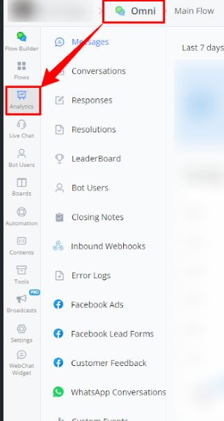
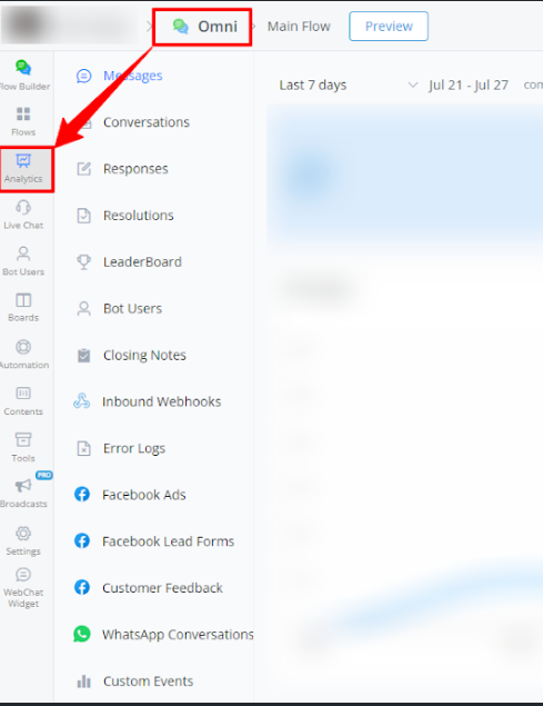
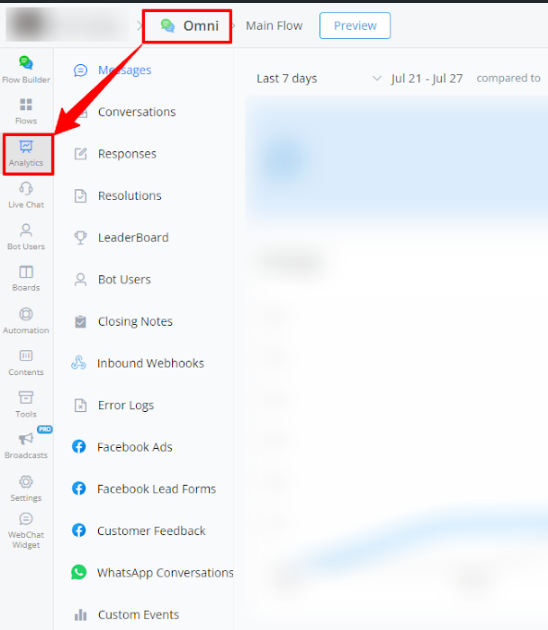
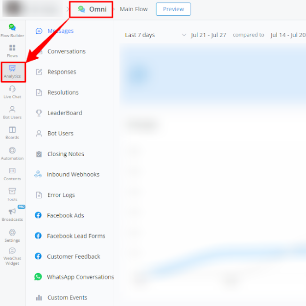
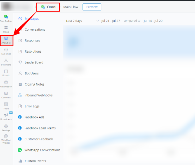
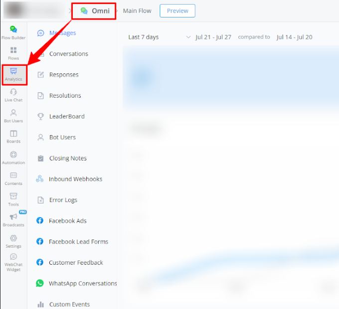
Analytic
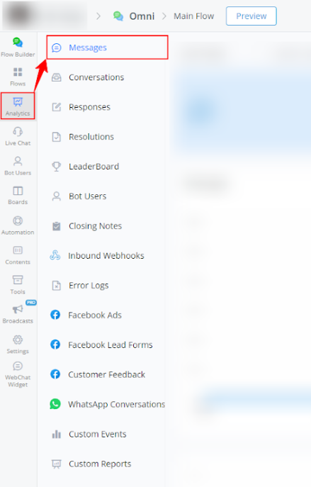
Message Reports
This report provides detailed information about the volume of messages sent and received in your channel, allowing you to monitor user activity and engagement over time.
Steps to Access
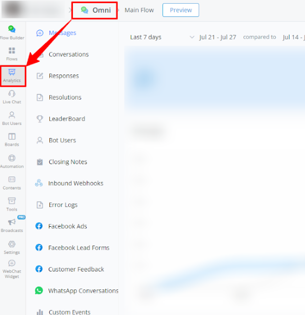
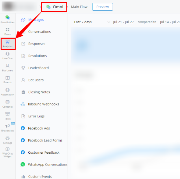
- Within your bot, go to Analytics.
- Select Messages from the left-side menu.
Available Report Types
Messages
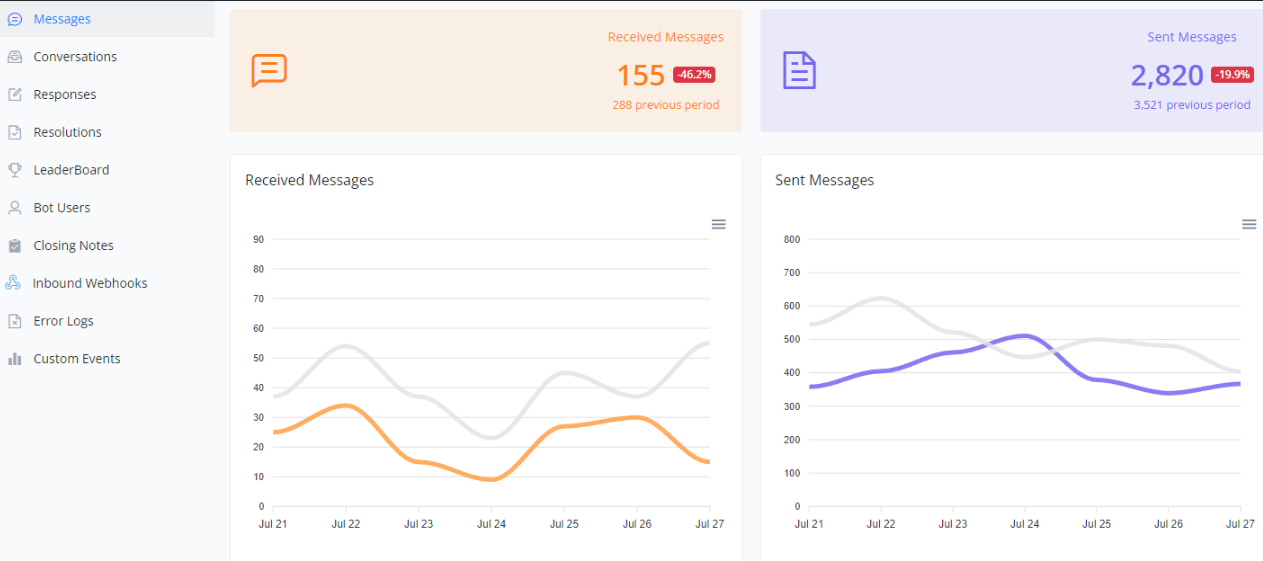
Analysis of Received and Sent Messages
This section details the metrics of received and sent messages over a specific period. The charts help visualize the fluctuations in communication and compare them to previous periods.
Line Charts
Received Messages:
- The orange line represents the received messages in the current period.
- The gray line represents the received messages in the previous period.
Sent Messages:
- The blue line represents the sent messages in the current period.
- The gray line represents the sent messages in the previous period.
Usefulness of the Charts
- Volume Analysis: Helps understand the volume of communication on different days, identifying patterns of high and low activity.
- Performance Evaluation: Assists in evaluating the effectiveness of responses and engagement with users.
- Period Comparison: Comparative visualization between different periods helps identify trends and potential areas for improvement.
Below is a visual example of the charts:
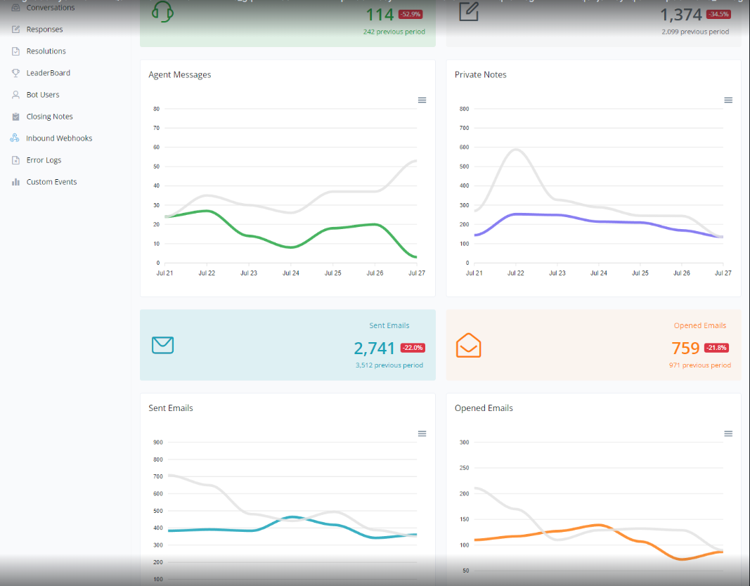
Analysis of Agent Messages, Private Notes, and Emails
This section provides a detailed overview of agent messages, private notes, and emails sent and opened during a specific period. The charts allow for a clear comparison between the current and previous periods, helping to assess performance and identify trends.
Agent Messages
- Line Chart:
- The green line represents agent messages in the current period.
- The gray line represents agent messages in the previous period.
Private Notes
- Line Chart:
- The blue line represents private notes in the current period.
- The gray line represents private notes in the previous period.
Emails Sent
- Line Chart:
- The light blue line represents emails sent in the current period.
- The gray line represents emails sent in the previous period.
Emails Opened
- Line Chart:
- The orange line represents emails opened in the current period.
- The gray line represents emails opened in the previous period.
Usefulness of the Charts
- Performance Evaluation: The charts help understand the efficiency of agent communication and the use of private notes.
- Email Analysis: Allows evaluation of reach and engagement through sent and opened emails.
- Trend Identification: Comparing periods helps identify changes and make informed decisions.
Below is a visual example of the charts:
Conversations
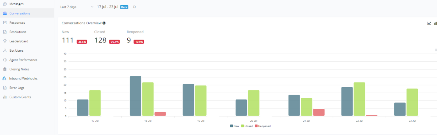
Conversation Overview
The number of new conversations started, the number of unique conversations that were first closed, and the number of unique conversations that were reopened
This section provides an overview of conversations over a specific period. The chart helps visualize the number of new, closed, and reopened conversations, facilitating the analysis of customer support activity and efficiency.
- New Conversations: Represented in blue, these are the conversations initiated by users during the period.
- Closed Conversations: Represented in green, these are the conversations that were closed during the period.
- Reopened Conversations: Represented in red, these are the conversations that were reopened after being closed.
Usefulness of the Chart
- Support Efficiency: By comparing the numbers of new, closed, and reopened conversations, it is possible to evaluate the support team’s efficiency and identify areas needing improvement.
- Activity Peaks Identification: The chart shows the days with the highest and lowest activity, allowing for resource allocation adjustments to improve support during peak times.
Below is a visual example of the chart:
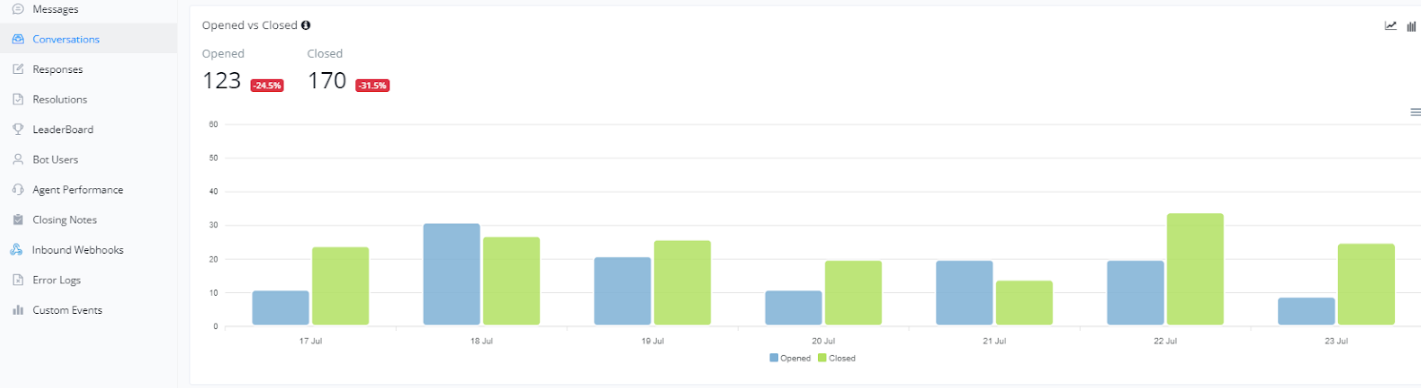
Opened vs. Closed Conversations
The number of conversations opened and the number of conversations that were closed
This section presents a comparison between the number of open and closed conversations over a specific period. The chart helps visualize customer support efficiency and identify potential bottlenecks or periods of high demand.
- Opened Conversations: Represented in blue, these are the conversations initiated by users during the period.
- Closed Conversations: Represented in green, these are the conversations that were closed during the period.
Usefulness of the Chart
- Support Efficiency: By comparing the numbers of open and closed conversations, it is possible to evaluate the support team’s efficiency. Ideally, the number of closed conversations should be close to the number of open conversations.
- Activity Peaks Identification: The chart shows the days with the highest and lowest activity, allowing for resource allocation adjustments to improve support during peak times.
Below is a visual example of the chart:
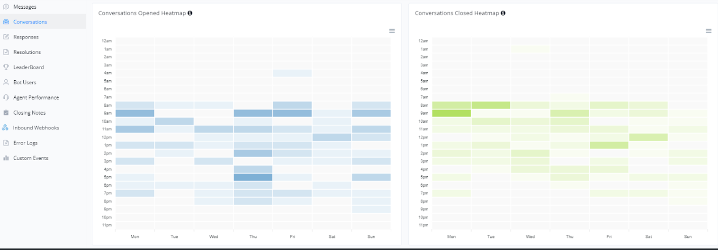
Heatmap of Opened and Closed Conversations
The conversations opened volume by day of the week and time of day.
In this section, we present heatmaps showing open and closed conversations throughout the week, segmented by hour of the day. These charts help identify activity patterns, allowing for optimized resource allocation and support planning.
Heatmap of Opened Conversations
- The chart on the left shows open conversations by day of the week and hour of the day. Darker colors indicate periods of higher activity.
- This heatmap is useful for identifying when users are most likely to initiate conversations, allowing for adjustments in the support team to cover peak times.
Heatmap of Closed Conversations
- The chart on the right shows closed conversations by day of the week and hour of the day. Similar to the heatmap of open conversations, darker colors indicate higher activity.
- This chart helps understand customer support efficiency and whether there are periods when conversations are closed more quickly.
Below is a visual example of these charts:
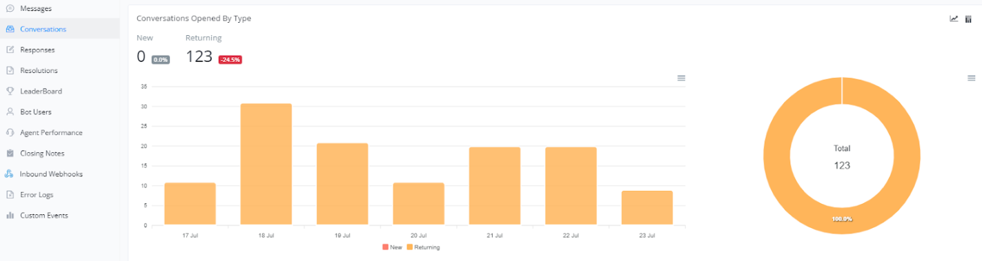
Opened Conversations by Type
In this section, we present an analysis of open conversations categorized by type. This metric is essential for understanding the dynamics of interactions, distinguishing between new users and returning users.
Opened Conversations by New and Returning Users
- The bar chart shows the number of open conversations by new users and returning users over the days. This helps us monitor how different types of users are interacting with the system.
- The donut chart on the right presents the overall proportion of open conversations by new and returning users, offering a clear view of the distribution of interactions.
Below is a visual example of these charts:
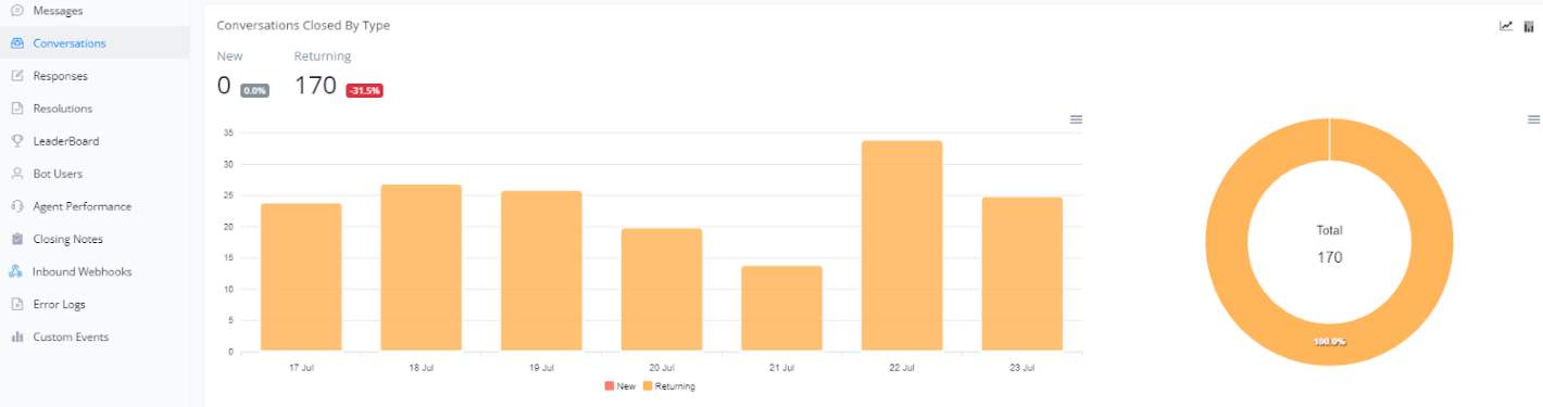
Closed Conversations by Type
In this section, we present an analysis of closed conversations categorized by type. This metric is important for understanding customer behavior and support efficiency.
New and Returning Closed Conversations
- The bar chart shows the number of new and returning conversations that were closed over the days. This helps us monitor how customers are interacting with support over time.
- The donut chart on the right presents the overall proportion of new versus returning closed conversations, offering a clear view of the distribution of closed interactions.
Below is a visual example of these charts:
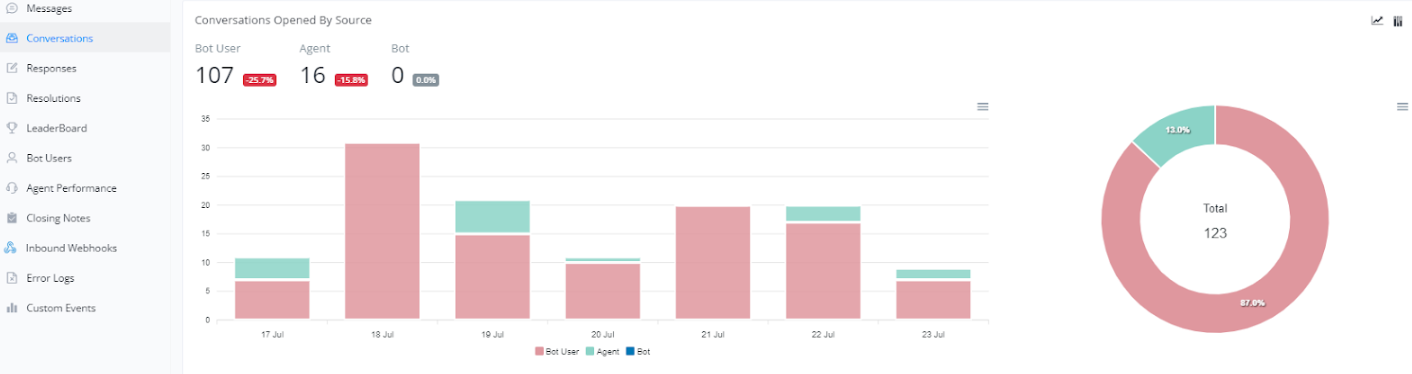
Open Conversations by Source
Bot user means bot user/contacts initiated, Agent means live chat agent, Bot means bot automation.
In this section, we present an analysis of open conversations categorized by source. This metric is essential for understanding the origin of interactions and evaluating the effectiveness of different support channels.
Open Conversations by Bot Users, Agents, and Bot
- Bot user means bot user/contacts initiated, Agent means live chat agent, Bot means bot automation.
- The bar chart shows the number of open conversations by bot users, agents, and the bot itself over the days. This helps us monitor how different channels are being utilized over time.
- The donut chart on the right presents the overall proportion of open conversations by each source, offering a clear view of the distribution of initiated interactions.
Below is a visual example of these charts:
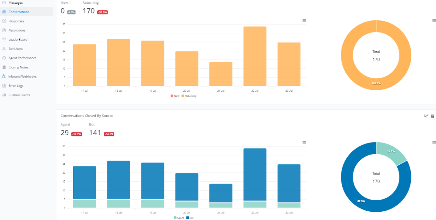
Conversations and Conversation Closures
In this section, we provide an overview of the number of conversations and how they were closed, either by an agent or a bot. Analyzing these metrics can help us better understand customer interaction with our support system.
New and Returning Conversations
- The bar chart at the top shows the number of new and returning conversations over the days. It is important to track this metric to understand the flow of interactions and customer loyalty to the support system.
- The donut chart on the right presents the overall proportion of new versus returning conversations, offering a clear view of the distribution.
Closed Conversations by Source
- The second bar chart illustrates the number of conversations closed by agents and bots over time. Monitoring this information helps identify the efficiency of each source in closing cases.
- The donut chart on the right presents the overall proportion of conversations closed by agents and bots, providing an overview of each one’s performance.
Below is a visual example of these charts:
Response
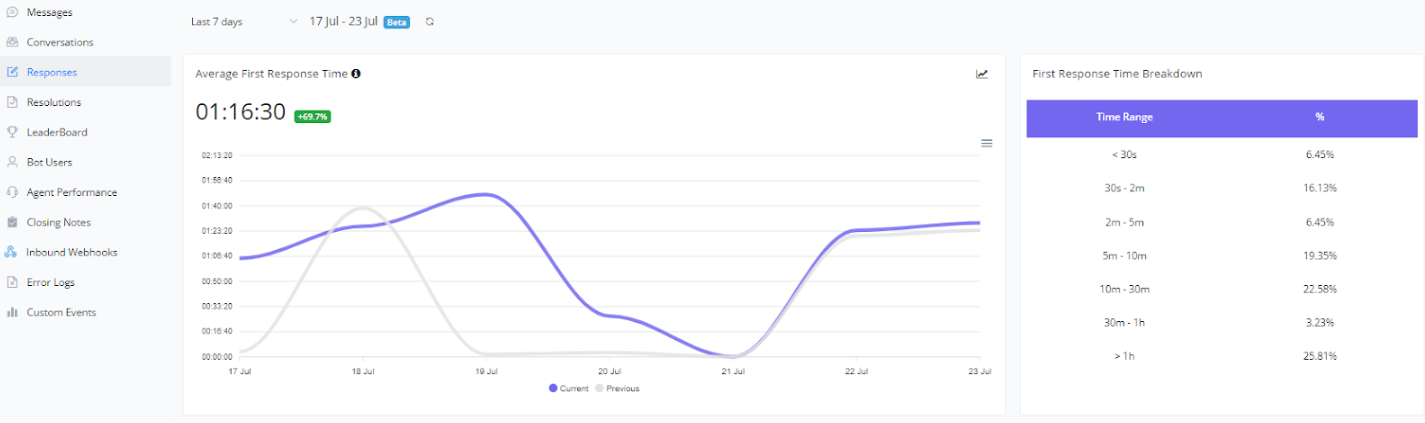
Average First Response Time
The average time taken for the first agent to send the first response from the time when the conversation is first time opened, only calculate the time within the office hours
This metric measures the average time it takes for an agent to respond to a request for the first time, providing a critical view of how quickly the support team is initially responding to customers.
Average First Response Time
- The line chart shows the average first response time over a period. Monitoring this metric is crucial for evaluating the initial efficiency of the support team and identifying areas that need improvement.
First Response Time Breakdown
- This bar chart presents the distribution of first response times across different time intervals, allowing for a more detailed analysis of the speed of first responses and helping to identify potential bottlenecks.
Below is a visual example of these charts:
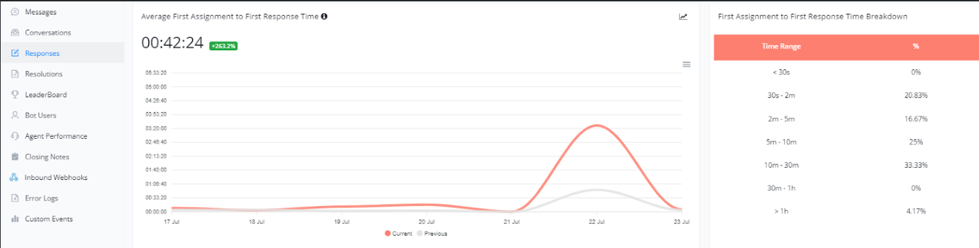
Average Time from First Assignment to First Response
The average time taken for the first agent to send the first response from the time when the conversation is first assigned, only calculate the time within the office hours
This metric measures the time from the first assignment of a case to the agent’s first response, helping to evaluate the initial efficiency in responding to customers.
Average Time from First Assignment to First Response
- The line chart shows the average time it takes for agents to respond from the first assignment of a case. Monitoring this metric is essential to ensure a quick and efficient response to customers from the beginning of the interaction.
First Assignment Response Time Breakdown
- This bar chart presents the distribution of response times across different time intervals, providing a detailed view of the speed of first responses and identifying areas for improvement.
Below is a visual example of these charts:
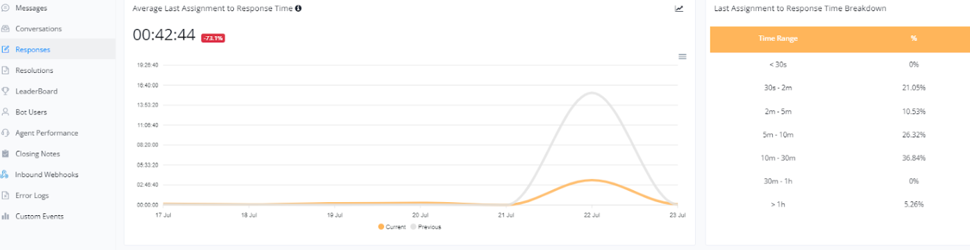
Average Time from Last Assignment to Response
The average time taken for the last assignee to send the first response from the time when the conversation is last assigned, only calculate the time within the office hours
This metric helps evaluate the efficiency of the final response from agents after the last assignment, which is crucial for ensuring customer requests are completed quickly.
Average Time from Last Assignment to Response
- The line chart presents the average time agents take to respond after the last assignment. Monitoring this metric helps us understand how quickly we are resolving the final issues for customers.
Last Assignment Response Time Breakdown
- This bar chart shows the distribution of final response times across different time intervals, providing a detailed view of how response times vary and where improvements can be made.
Below is a visual example of these charts:
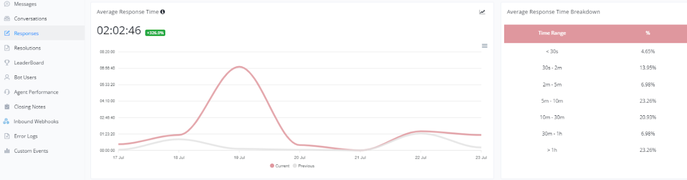
Average Response Time
The average time taken to respond to the incoming message from the contact by all assignees, only calculate the time within the office hours
This metric is crucial for evaluating how quickly agents respond to customer messages, helping to measure the efficiency of our customer service.
Average Response Time
- This line chart shows the average response time of agents for each customer interaction. Monitoring this metric allows us to identify if agents are responding promptly to customer requests.
Response Time Breakdown
- This bar chart illustrates the distribution of response times across different time intervals. It provides a clear view of how quickly agents are responding, enabling us to identify areas needing improvement.
Below is a visual example of these charts:
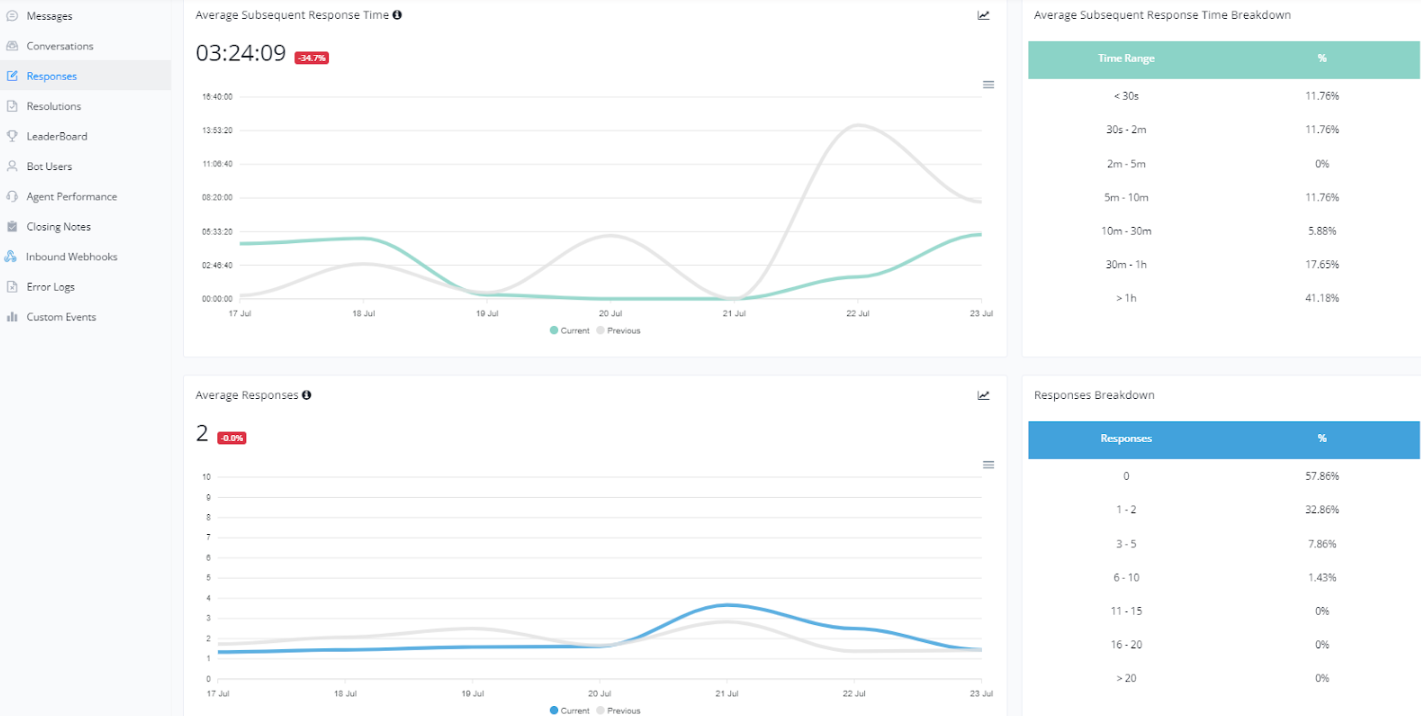
Average Subsequent Response Time and Average Number of Responses
The average time taken for any agents to respond to contacts for every subsequent reply after the first reply, only calculate the time within the office hours
These metrics are essential for understanding the efficiency and quality of our customer service, particularly in the continuity and number of interactions needed to resolve an issue.
For example, if the user send the message at 00:00, and then the live chat agent replied to this message at 01:00, and then the first response time will be 1 minutes, but the agent send another subsequent message to the user at 03:00, and then the subsequent response time will be 2 minutes.
Average Subsequent Response Time
- This line graph shows the average time between subsequent responses after the first interaction. Monitoring this metric helps identify if agents are responding promptly to customers during ongoing conversations.
- Subsequent Response Time Breakdown: This bar chart illustrates the distribution of subsequent response times in different time intervals. It helps visualize how quickly agents are responding after the first response.
Average Number of Responses
- This line graph shows the average number of responses needed to resolve a conversation. A lower number of responses may indicate a more efficient and clear resolution of customer issues.
- Response Breakdown: This bar chart shows the distribution of the number of responses per conversation. It helps identify how many interactions are frequently needed to resolve a conversation.
Below is a visual example of these graphs:
Definition of Agent Response Time
1. Understanding the Context
There are three message types:
TYPE_USER_IN→ user sends a message (customer).TYPE_BOT_OUT→ bot replies.TYPE_AGENT_OUT→ live agent replies.
Agents may join mid-conversation, where the bot is already replying automatically. When the agent replies, the bot pauses temporarily.
The goal is to measure:
“How long it takes an agent to respond to a user’s message that needs human attention.”
🧩 2. Core Definition of Agent Response Time
Agent Response Time (ART) =
The time difference between the user’s last message that requires a human response and the agent’s first outgoing message after that.
However, since a bot might respond automatically before the agent takes over, we need to ignore bot messages when computing ART.
That means:
- Only measure from the user’s message (TYPE_USER_IN)
- To the next agent reply (TYPE_AGENT_OUT)
- While ignoring intermediate bot messages (TYPE_BOT_OUT)
🧠 3. Rules for Accurate Measurement
| Case | Description | Should Count as Response Time? |
|---|---|---|
| User sends message → Agent replies directly | Standard case | ✅ Yes |
| User sends message → Bot replies → Agent later joins | Agent took over after bot | ✅ Yes (start from user message, not bot) |
| Bot sends proactive message → Agent replies | No user message triggered it | ❌ No |
| Agent replies to another agent | Internal collaboration | ❌ No |
| Agent replies after user message but after a long gap (bot paused, waiting for agent) | Still counts | ✅ Yes |
| User sends multiple messages before agent replies | Use the last user message before the agent reply | ✅ Yes |
4. Algorithm / Logic Flow
You can calculate the agent response time like this:
- For each TYPE_AGENT_OUT message:
- Look backward in time for the most recent TYPE_USER_IN message.
- Ignore any
TYPE_BOT_OUTorTYPE_AGENT_OUTmessages in between. - Compute the time difference:
ART = agent_out.timestamp - user_in.timestamp
- Exclude:
- If there is no prior TYPE_USER_IN.
- If the last message before agent reply was another agent message.
- If the agent message is part of a rapid sequence (same agent continuing conversation).
💡 If the agent sends multiple messages in a row, only the first message after the user input counts as a “response.”
Resolutions
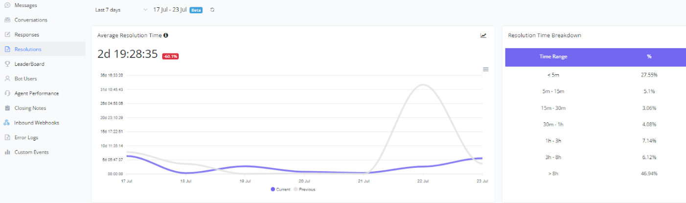
Average Resolution Time
💡 The average time taken for the first agent to send the first response from the time when the conversation is first time opened, only calculate the time within the office hours
The Average Resolution Time is a crucial metric that helps us assess the efficiency of our customer service process. This metric indicates the average time it takes to resolve and close a conversation. Below are the details of this metric:
Average Resolution Time
- This line chart shows the average time it takes to resolve a conversation from start to finish. Monitoring this metric allows us to identify trends and possible delays in the resolution process, helping us implement continuous improvements.
Resolution Time Breakdown
- This bar chart shows the distribution of resolution times across different time intervals. It helps us understand how long conversations take to be resolved and whether there are specific patterns that can be optimized for more efficient service.
Below is a visual example of these charts:
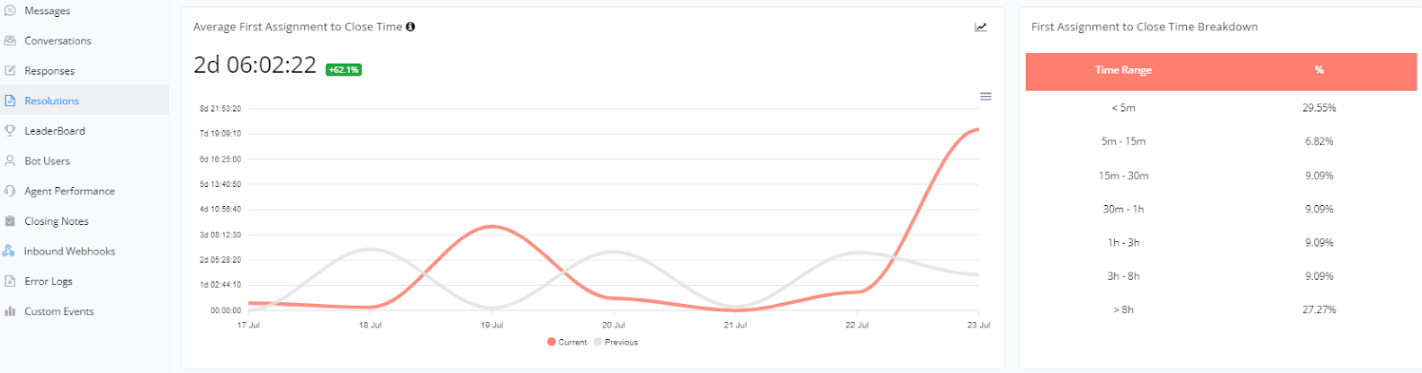
Average Time from First Assignment to Closure
💡 The average time taken for first time close a conversation from the time when the conversation is first assigned, only calculate the time within the office hours
To monitor the efficiency of our resolution process from the beginning, we analyze the Average Time from First Assignment to Closure. This metric helps us understand how long it takes from when a conversation is first assigned to an agent until it is resolved and closed. Below are the details of this metric:
Average Time from First Assignment to Closure
- This line graph shows the average time it takes for a conversation to be closed after its first assignment. It helps us evaluate the effectiveness of the resolution process from start to finish and identify areas that may need improvement.
Breakdown of Time from First Assignment to Closure
- This bar chart shows the distribution of closure times in different time intervals after the first assignment. It helps identify how quickly issues are being resolved and if there are specific steps that can be optimized for faster closure.
Below is a visual example of these graphs:
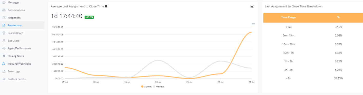
Average Time from Last Assignment to Closure
💡 The average time taken to close a conversation calculated from the time when the conversation is last assigned, only calculate the time within the office hours
To better understand the efficiency in resolving conversations, we analyze the Average Time from Last Assignment to Closure. This metric indicates how long it takes from when a conversation is last assigned to an agent until it is finally resolved and closed. Below are the details of this metric:
Average Time from Last Assignment to Closure
- This line graph shows the average time it takes for a conversation to be closed after its last assignment. It helps us evaluate the effectiveness of closing conversations and identify any potential delays.
Breakdown of Time from Last Assignment to Closure
- This bar chart shows the distribution of closure times in different time intervals after the last assignment. It helps identify the efficiency of the final resolution process and if there are steps that can be optimized for faster closure.
Below is a visual example of these graphs:
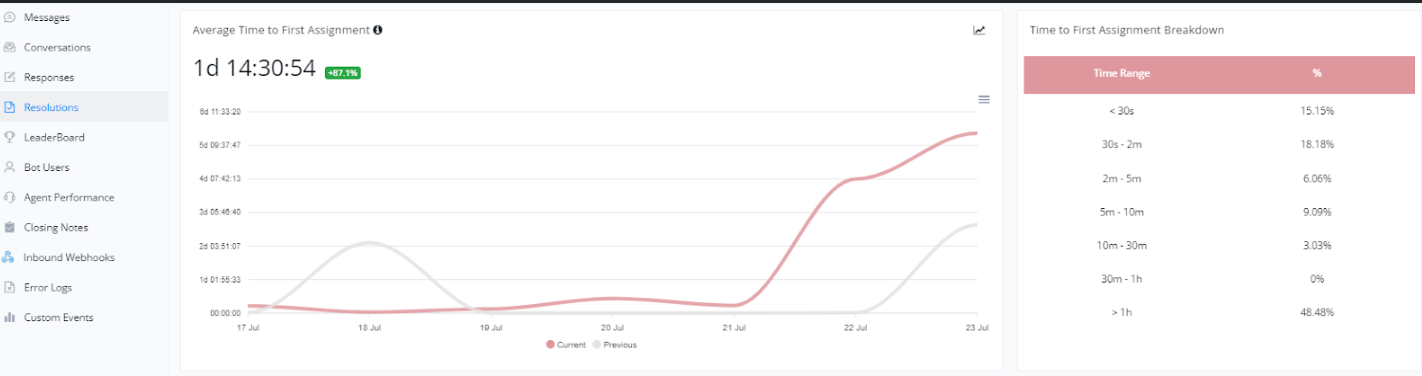
Average Time to First Assignment
💡 The average time taken to assign a conversation to the first assignee from the time when the conversation is opened, only calculate the time within the office hours
To monitor workflow efficiency and ensure conversations are handled promptly, we analyze the Average Time to First Assignment. This metric shows how long it takes for a conversation to be assigned to an agent after it is received. Below are the details of this metric:
Average Time to First Assignment
- This line graph shows the average time it takes for a conversation to be assigned to an agent. It helps us evaluate how quickly conversations are being directed towards resolution.
Breakdown of Time to First Assignment
- This bar chart shows the distribution of assignment times across different time intervals. It helps identify the efficiency of the assignment process and whether there are significant delays that need to be addressed.
Below is a visual example of these graphs:
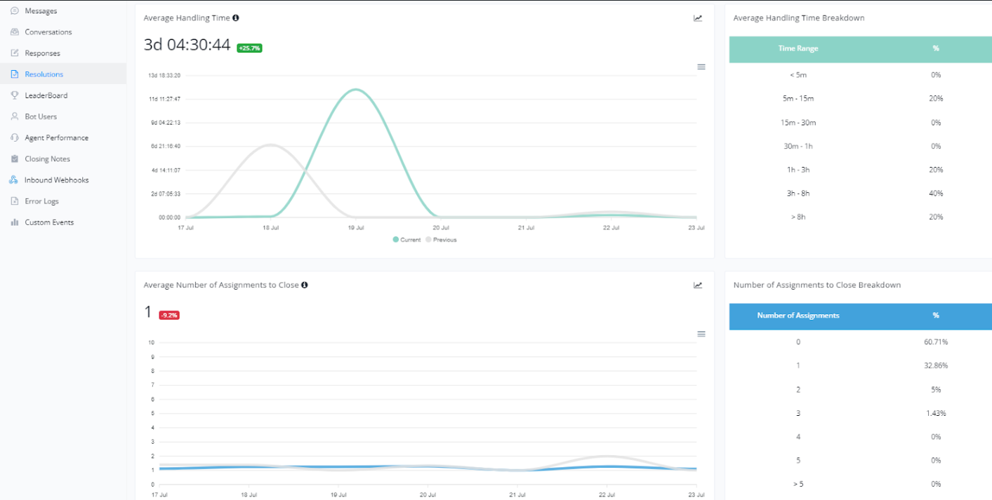
Average Handling Time and Assignments
💡 The total amount of time that the conversation was being handled by agents. A conversation is being handled when it is assigned to any agent and has a status of Open, only calculate the time within the office hours
To further improve customer service, we monitor the Average Handling Time and the Number of Assignments until Closure. These metrics provide detailed insights into agent efficiency and workload. Below are the details of these metrics:
Average Handling Time
- This line graph shows the average time an agent takes to handle a conversation from start to resolution. It is important for evaluating the efficiency of customer service and identifying areas that may need optimization.
Breakdown of Average Handling Time
- This bar chart shows the distribution of handling times across different time intervals. It helps identify how long conversations typically take to be resolved, providing insights into possible improvements in the service process.
Average Number of Assignments until Closure
💡 The average number of assignments before close the conversation, Unassign also consider as one assignment count.
This line graph shows the average number of times a conversation is assigned to different agents before it is closed. This can indicate the complexity of customer issues or the need for additional agent training.
Breakdown of Number of Assignments until Closure
- This bar chart shows the percentage of conversations closed after a certain number of assignments. It helps understand the efficiency of the workflow and whether adjustments are needed to reduce the number of transfers between agents.
Below is a visual example of these graphs:
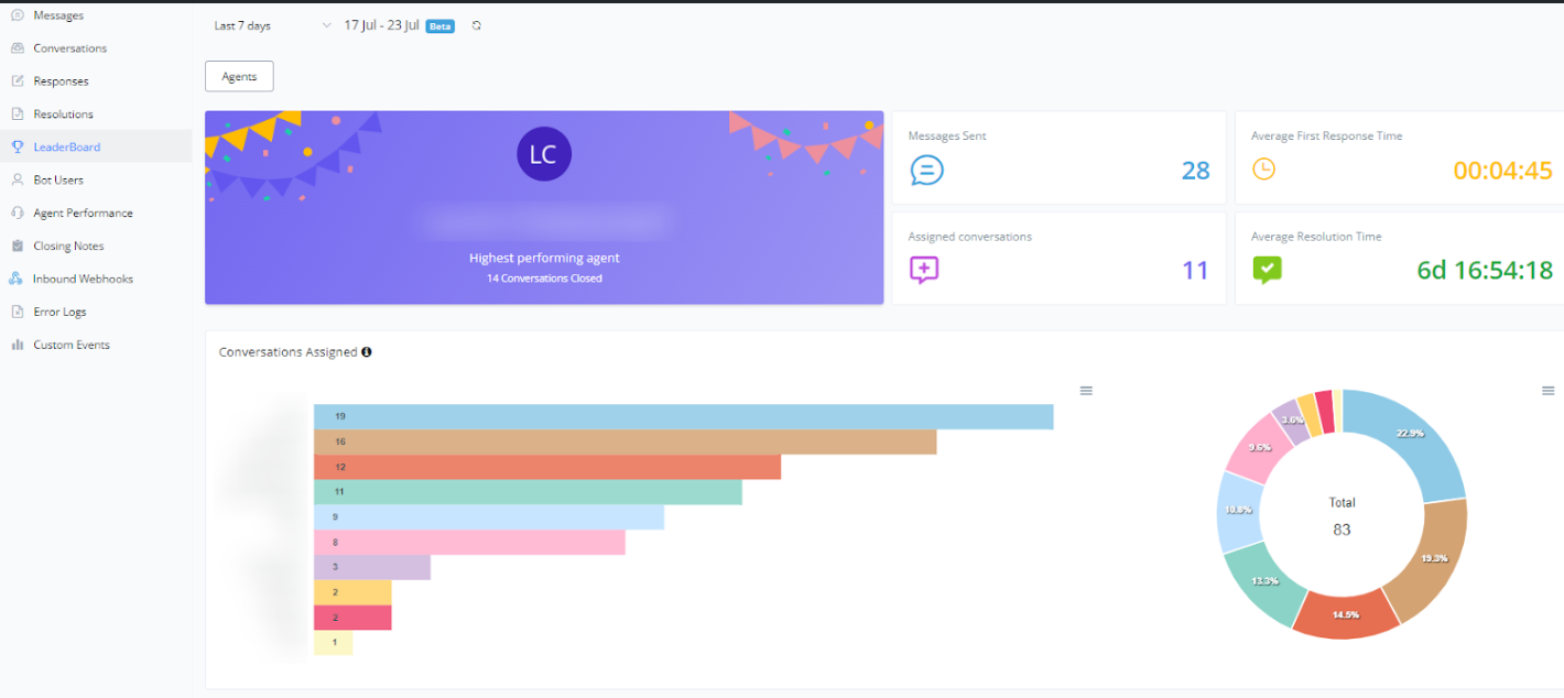
LeaderBoard
Viewing Agent Performance
The agent performance dashboard in conversation mode offers a comprehensive view of your support team’s efficiency and effectiveness. Below, we detail the main elements presented:
Top Performing Agent
- Displays the agent who had the best performance in the selected period, indicating the number of closed conversations.
Messages Sent
- Shows the total number of messages sent by the agent or team during the period.
Assigned Conversations
- Indicates the number of conversations assigned to agents.
Average First Response Time
- Presents the average time agents take to respond to a new conversation.
Average Resolution Time
- Displays the average time needed to resolve conversations.
Assigned Conversations Chart
- A bar chart showing the number of conversations assigned to each agent.
Conversation Distribution Chart
- A donut chart illustrating the percentage distribution of conversations among agents.
Below is a visual example of this dashboard:
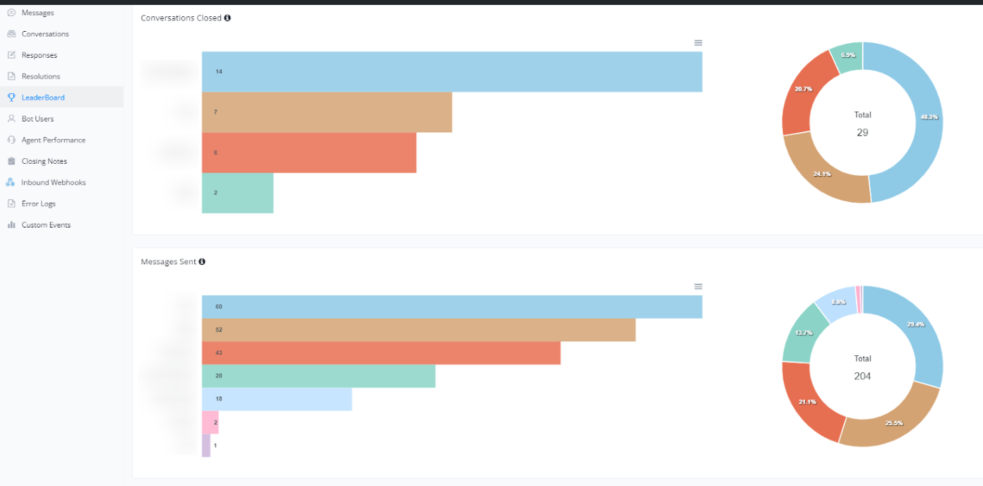
Analysis of Closed Conversations and Messages Sent
The conversation mode also allows for the analysis of agent performance in terms of closed conversations and messages sent. Below, we detail the information presented:
Closed Conversations
- A bar chart shows the number of conversations closed by each agent.
- A donut chart displays the percentage distribution of closed conversations among agents, providing a clear view of who is closing the most conversations.
Messages Sent
- A bar chart details the number of messages sent by each agent.
- A donut chart illustrates the percentage distribution of messages sent, offering insights into the messaging activity of the agents.
These charts help identify performance patterns and the productivity of each agent, enabling better management and resource allocation.
Below is a visual example of these charts:
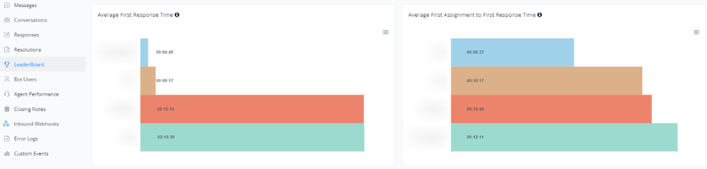
Average First Response Time and Average Assignment to First Response Time
The conversation mode also provides valuable insights into agent response times, focusing on the average first response time and the average assignment to first response time. Below, we detail this information:
Average First Response Time
- A bar chart showing the average time each agent takes to provide the first response to a new conversation. This helps monitor how quickly agents address customers for the first time.
Average Assignment to First Response Time
- A bar chart presenting the average time from when a conversation is assigned to an agent until their first response. This allows for the analysis of agent efficiency after being designated a conversation.
These charts are essential for evaluating the effectiveness of agents in responding quickly to customer inquiries, contributing to better customer service.
Below is a visual example of these charts:
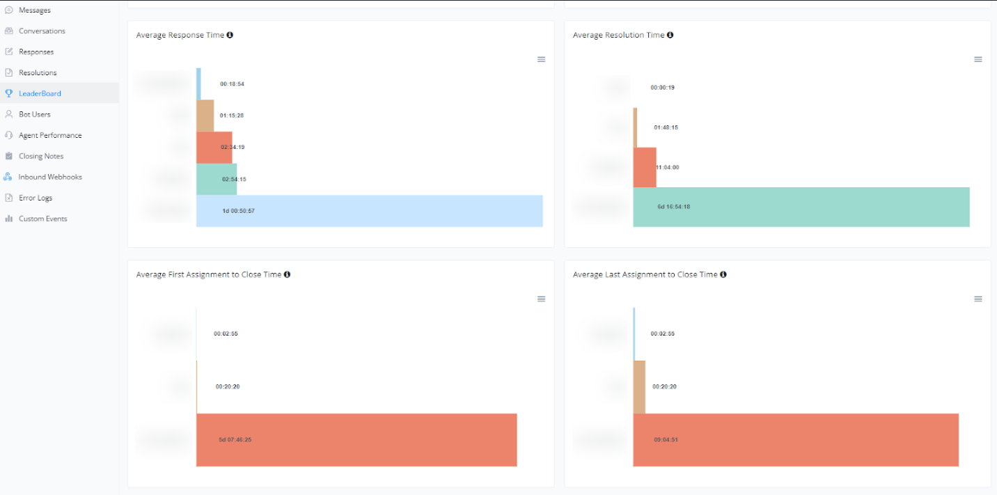
Average Response, Resolution, and Closure Times
In conversation mode, important metrics related to response, resolution, and closure times are also monitored. These metrics help ensure efficient service and identify areas that need improvement. Below, we detail this information:
Average Response Time
- A bar chart showing the average time each agent takes to respond to customer messages. This metric is crucial to ensure customers receive timely responses, improving customer satisfaction.
Average Resolution Time
- A bar chart presenting the average time it takes to completely resolve a conversation. This helps monitor problem-solving efficiency and identify potential bottlenecks in the support process.
Average First Assignment to Closure Time
- A bar chart showing the average time from the first assignment of the conversation to an agent until closure. This metric is useful for evaluating the overall efficiency of the support process.
Average Last Assignment to Closure Time
- A bar chart detailing the average time from the last assignment of the conversation to closure. This can help identify if there are delays in the process of closing conversations.
Below is a visual example of these charts:
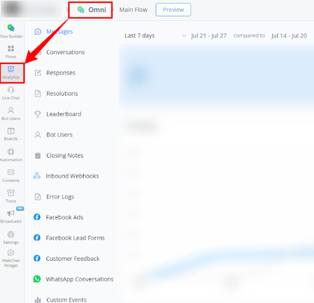
Bot Users Report
This report tracks data about the users interacting with the bot, offering a detailed view of user profiles and behavior.
Steps to Access:
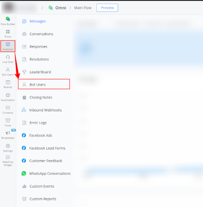
- Within your bot, go to Analytics.
- Select Bot Users from the left-side menu.
Available Report Types
- Bot user count statistics
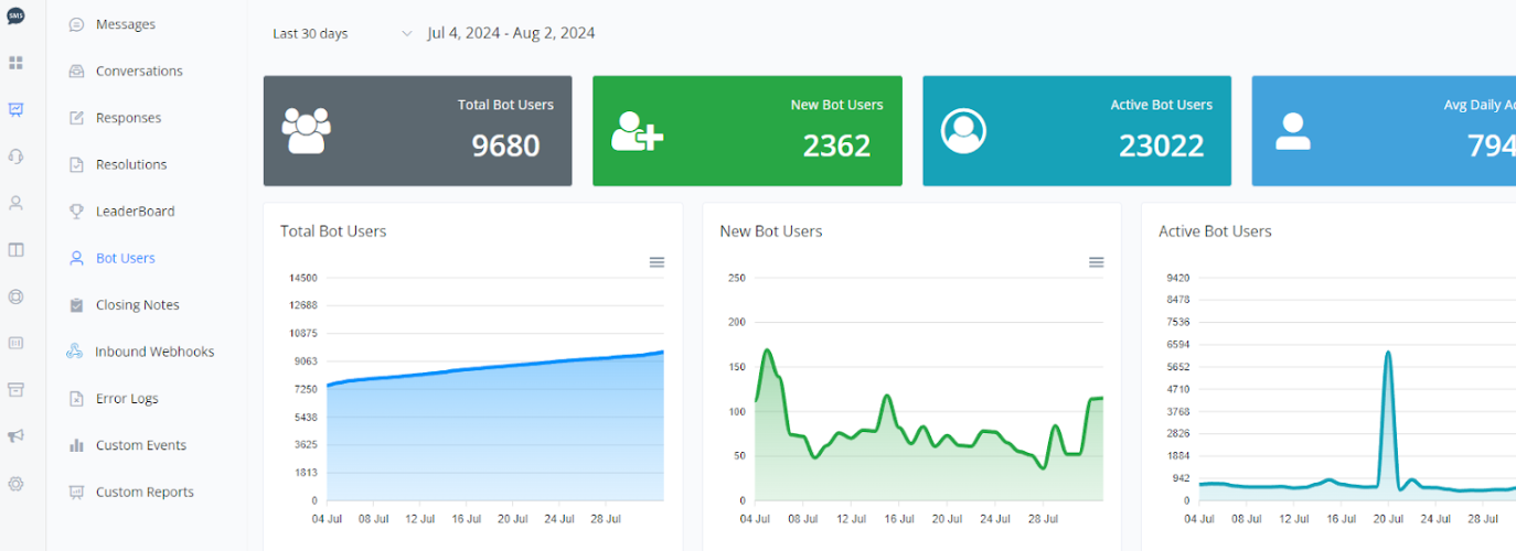
This section provides a comprehensive view of bot user statistics, with detailed charts on total bot users, new bot users, active bot users, and daily average active bot users.
1.1 Total Bot Users
- Line Graph: The graph shows a steady increase in the total number of bot users over the period.
1.2 New Bot Users
- Line Graph: The graph shows daily fluctuations in the number of new bot users, with evident peaks on specific dates.
1.3 Active Bot Users
- Line Graph: The graph shows the activity of bot users over the period, with a significant peak on a specific date.
1.4 Daily Average of Active Users
- Line Graph: The graph indicates the daily average of active users, providing a clear view of daily engagement.
Utility of the Graphs
- Growth Evaluation: The graphs help monitor the growth in the number of bot users.
- Identification of Activity Peaks: Allows identification of dates with high activity, which can be correlated with specific events.
- Daily Engagement: The daily average of active users helps evaluate the continuous engagement of users with the bot.
Below is a visual example of the graphs:
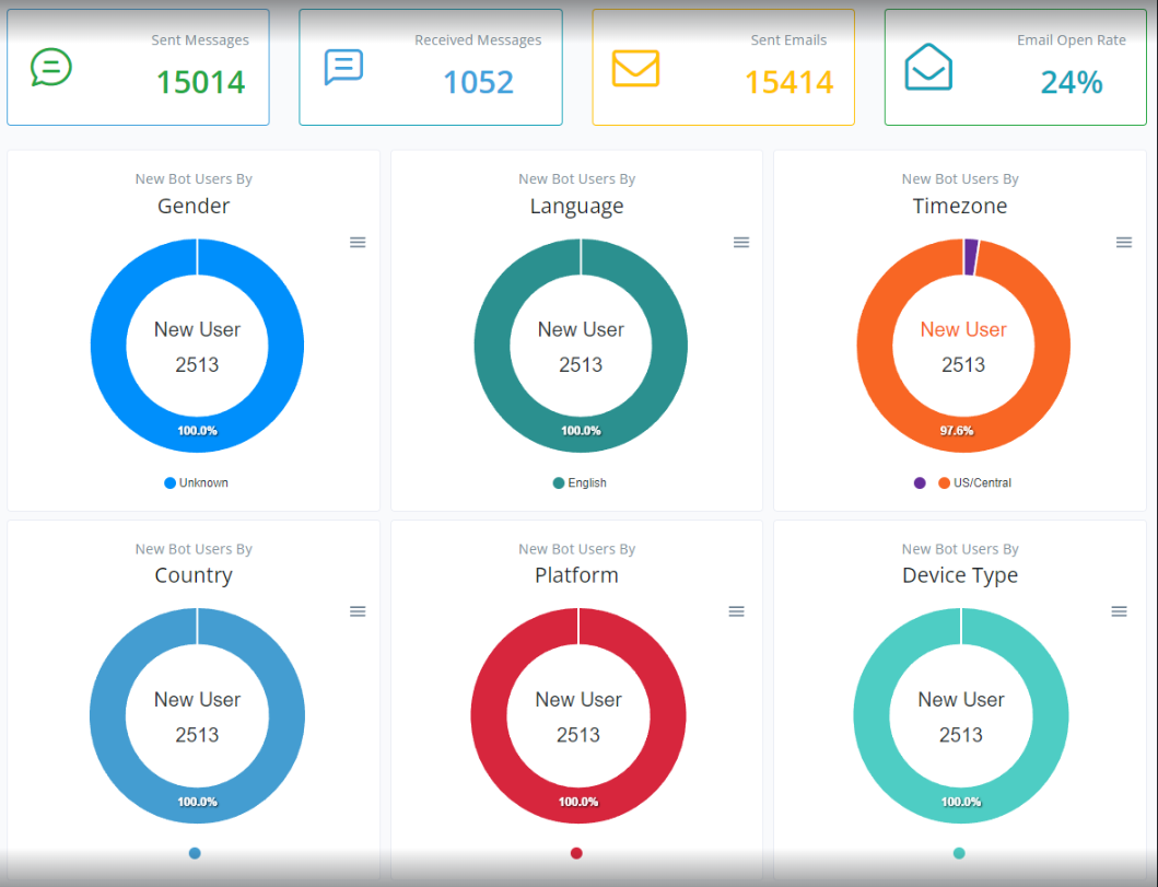
Bot Usage Statistics
This section provides a comprehensive view of bot usage statistics, including the number of messages sent and received, emails sent, and email open rate. Detailed graphs on new bot users categorized by gender, language, time zone, country, platform, and device type are also provided.
2.1 Messages and Emails
- Messages Sent
- Messages Received
- Emails Sent
- Email Open Rate
2.2 New Bot Users
The following graphs show the distribution of new bot users across various categories.
- Gender
- Language
- Time Zone
- Country
- Platform
- Device Type
Utility of the Graphs
- Messages and Emails Analysis: Allows monitoring the volume of messages and emails generated by the bot and the email open rate, helping to assess the effectiveness of email campaigns.
- User Profile: The graphs provide insights into the profile of new users, allowing for better segmentation and personalization of interactions.
Below is a visual example of the graphs:
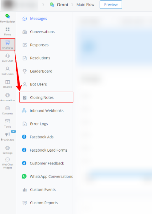
Closing Notes Report
The Closing Notes Report allows you to review the notes left when interactions with users are closed, helping to better understand the context of conversations.
Steps to Access:
- Within your bot, go to Analytics.
- Select Closing Notes from the left-side menu.
Available Report Types
Category Count and Bot User Graphs
The following graphs show daily variations in the category count and the number of bot users.
- Orange and Gray Lines: Represent the category count in the current and previous periods, respectively.
Bot User Graph
- Purple and Gray Lines: Represent the number of bot users in the current and previous periods, respectively.
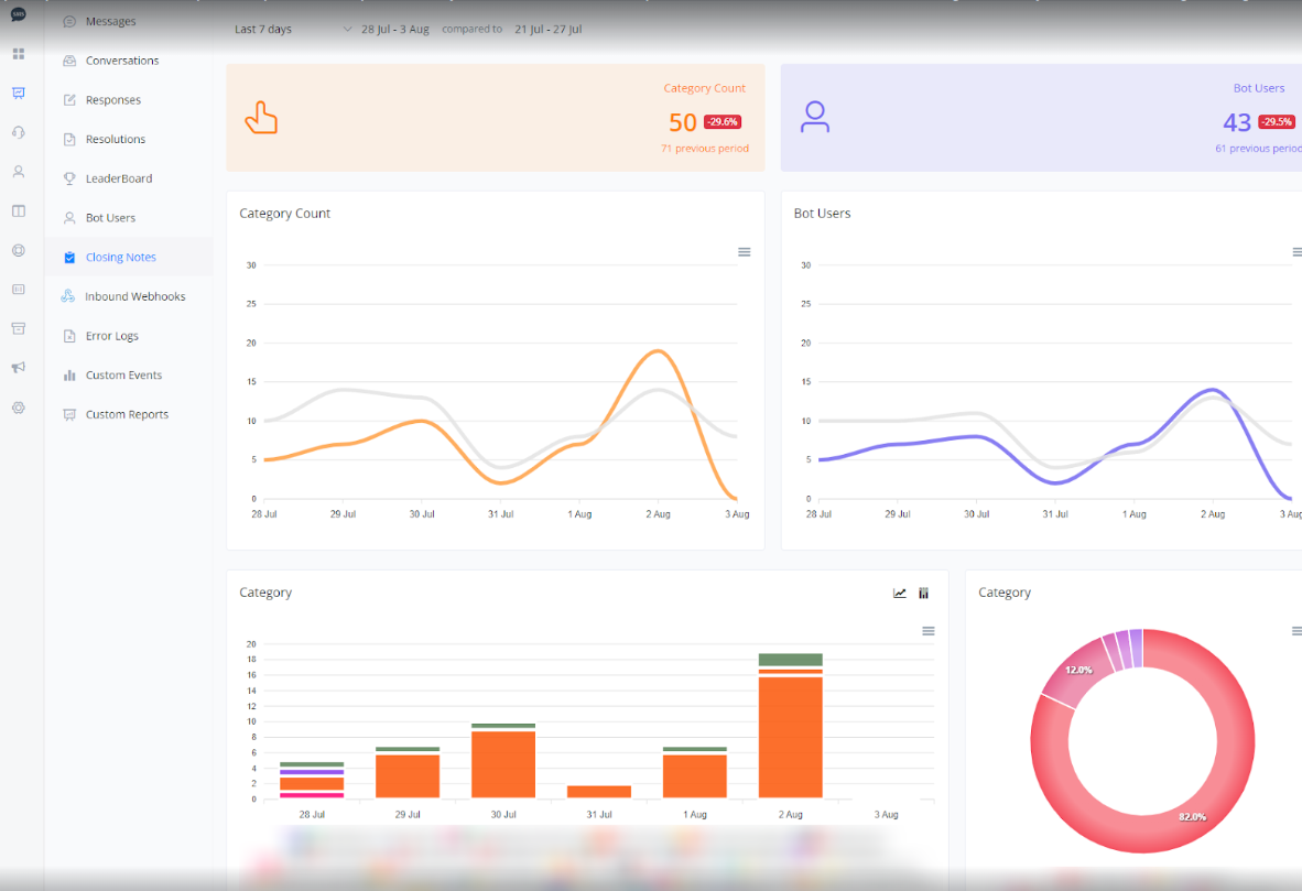
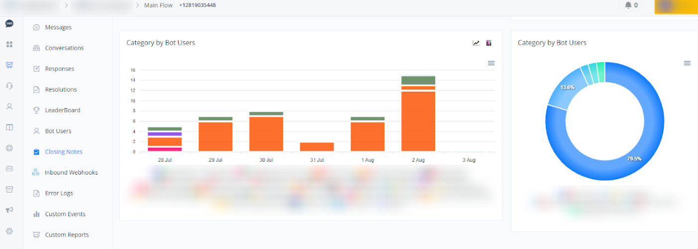
1.3 Category by Bot Users
The following graphs show the distribution among different closing notes added for the bot users. These data help visualize how closing notes are being categorized over time.
- Bar Graph: Represents the number of closing notes added in each category for different bot users over the current and previous periods.
- Donut Chart: Provides a percentage view of the distribution of closing note categories added by each bot user, allowing for a quick analysis of the proportion between categories.
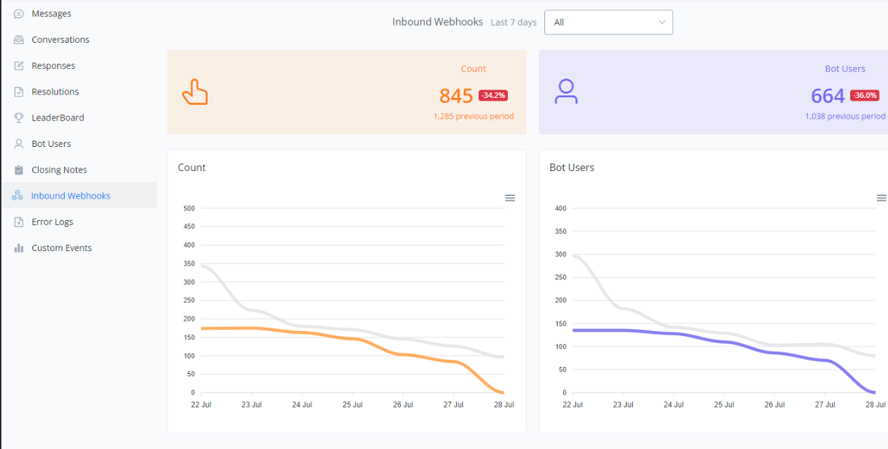
Inbound Webhook Report
Inbound Webhooks Report
This report shows the received webhook calls and their responses, essential for monitoring integration with other systems and services.
Steps to Access:
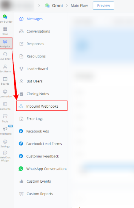
- Within your bot, go to Analytics.
2 Select Inbound Webhooks from the left-side menu.
Available Report Types
Analysis of Inbound Webhooks from the Last 7 Days
This section provides a detailed analysis of the inbound webhooks recorded by the bot over the last 7 days, with a comparison to the previous period.
General Metrics
- Webhook Count
- Bot Users
Webhook Count and Bot User Count Graphs
The following graphs show the daily variations in the count of inbound webhooks and the number of bot users.
Webhook Count Graph
- Orange and Gray Lines: Represent the webhook count in the current and previous periods, respectively.
Bot User Graph
- Purple and Gray Lines: Represent the number of bot users in the current and previous periods, respectively.
Below is a visual example of the graphs:
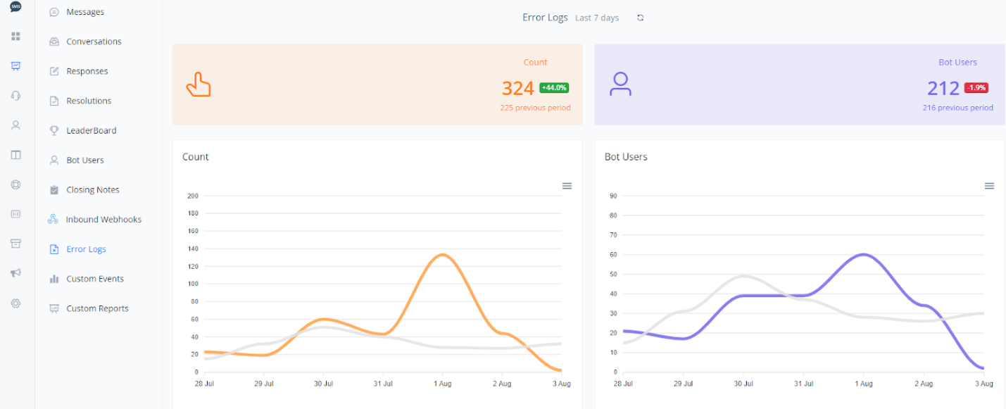
Error Log Report
Error Logs Report
The Error Logs Report displays error logs that occurred during the bot’s operation, crucial for identifying and quickly fixing issues.
Steps to Access:
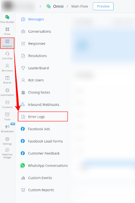
- Within your bot, go to Analytics.
- Select Error Logs from the left-side menu.
Available Report Types
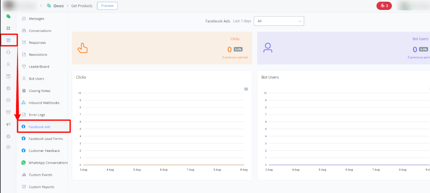
Facebook Ads Report
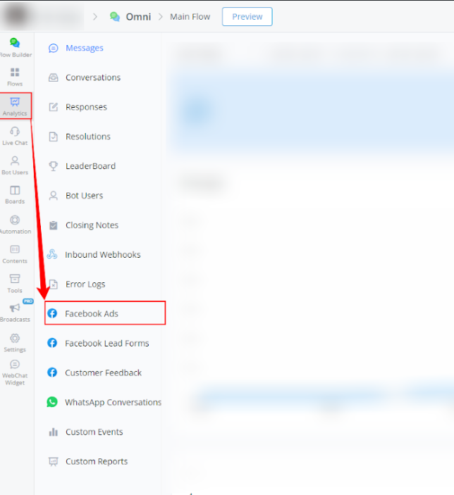
This report tracks the performance of ads linked to the Facebook Channel, providing essential data to optimize advertising campaigns.
Steps to Access:
- Within your bot, go to Analytics.
- Select Facebook Ads from the left-side menu.
Available Report Types
Here is a brief explanation for the graphs in the Facebook Ads reports:
Line Graphs
- Clicks:
- The orange line represents clicks in the current period.
- The gray line represents clicks in the previous period.
- Bot Users:
- The blue line represents bot users in the current period.
- The gray line represents bot users in the previous period.
Filtering
- In the Facebook Ads reports, you can filter the data displayed in the graph by all ads or by a specific ad reference payload, allowing for a more detailed performance analysis.
These descriptions provide a clear understanding of how to interpret the graphs and use the available filters to analyze the relevant data in each report.
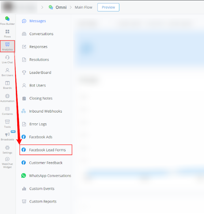
Facebook Lead Forms Report
The Facebook Lead Forms Report analyzes the leads generated through forms, helping to evaluate the effectiveness of lead capture campaigns.
Steps to Access:
- Within your bot, go to Analytics.

- Select Facebook Lead Forms from the left-side menu.
Available Report Types
Here is a brief explanation for the graphs in the Facebook Lead Forms reports:
Line Graphs
- Clicks:
- The orange line represents clicks in the current period.
- The gray line represents clicks in the previous period.
- Bot Users:
- The blue line represents bot users in the current period.
- The gray line represents bot users in the previous period.
Filtering
- In the Facebook Lead Forms reports, you can filter the data displayed in the graph by all ads or by a specific ad reference payload, allowing for a more detailed performance analysis.
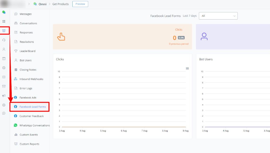
These descriptions provide a clear understanding of how to interpret the graphs and use the available filters to analyze the relevant data in each report.
Customer Feedback Report
This report shows user ratings and feedback about the Facebook Channel, providing valuable insights to improve service and user experience.
Steps to Access:
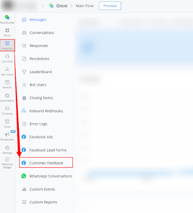
- Within your bot, go to Analytics.
- Select Customer Feedback from the left-side menu.
Available Report Types
Here is a brief explanation for the graphs in the Customer Feedback reports:
Line Graphs
- Customer Feedback:
- The orange line represents feedback received in the current period.
- The gray line represents feedback received in the previous period.
- Bot Users:
- The blue line represents bot users in the current period.
- The gray line represents bot users in the previous period.
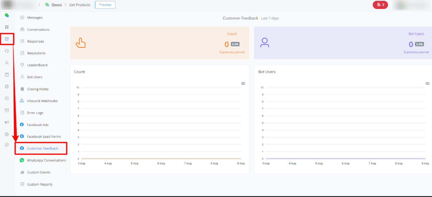
These descriptions provide a clear understanding of how to interpret the graphs and use the available filters to analyze the relevant data in each report.
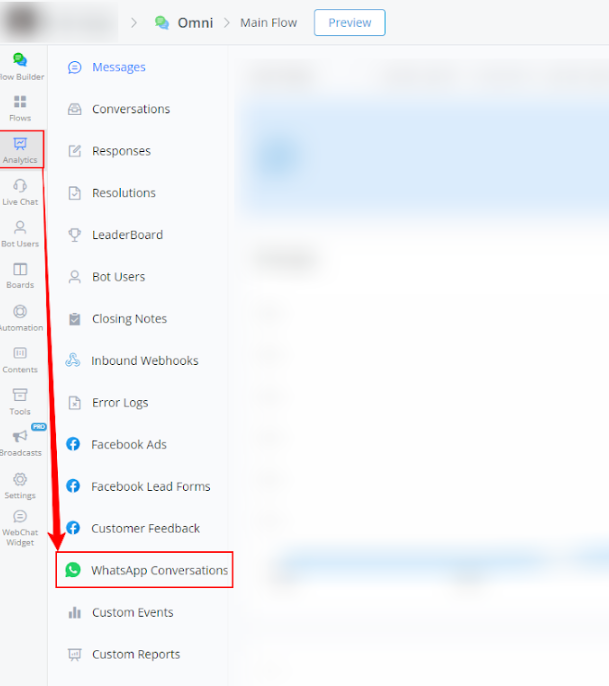
WhatsApp Conversations Report
The WhatsApp Conversations Report monitors interactions carried out through WhatsApp, essential for evaluating engagement and communication effectiveness.
Steps to Access:
- Within your bot, go to Analytics.
- Select WhatsApp Conversations from the left-side menu.
Available Report Types
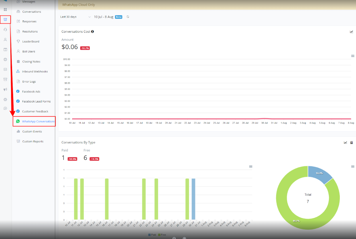
Here is a brief explanation for the graphs in the WhatsApp Conversations reports:
Conversations Cost:
Line Graph:
- The red line represents the cumulative cost of conversations over the selected period.
Conversations by Type:
Bar Graph:
- The green bars represent paid conversations.
- The light blue bars represent free conversations.
Pie Chart:
- The green section shows the percentage of paid conversations.
- The light blue section shows the percentage of free conversations.
Conversations by Category:
Bar Graph:
- The green bars represent marketing conversations.
- The red bars represent authentication conversations.
- The blue bars represent service conversations.
- The gray bars represent utility conversations.
Pie Chart:
- The green section shows the percentage of marketing conversations.
- The red section shows the percentage of authentication conversations.
- The blue section shows the percentage of service conversations.
- The gray section shows the percentage of utility conversations.
Messages by Status:
Bar Graph:
- The blue bars represent sent messages.
- The red bars represent delivered messages.
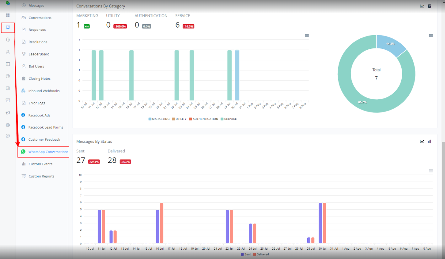
These reports help monitor the costs, types, categories, and status of messages within WhatsApp conversations, providing valuable insights for performance analysis.
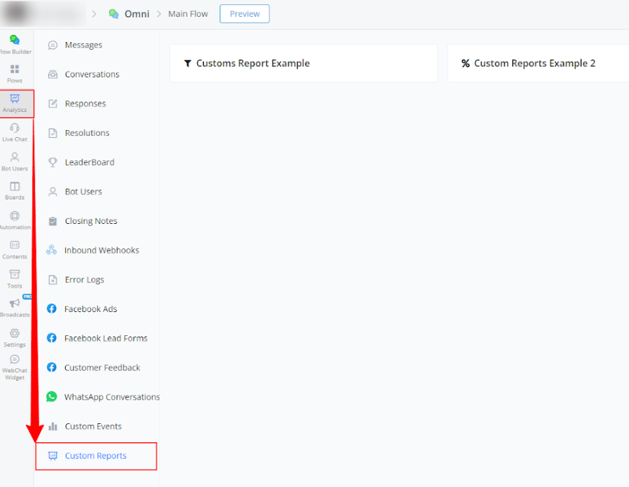
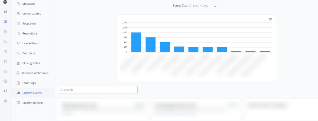
Custom Event Report
Custom Events Report
This report tracks custom events configured in the bot, allowing analysis of specific interactions and measurement of customized user actions.
Note: For these reports to be available, you must have previously created and configured Custom Events.
Steps to Access:
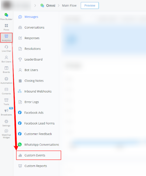
- Within your bot, go to Analytics.
2 Select Custom Events from the left-side menu.
Available Report Types
Custom Report
The Custom Reports section allows you to view the custom reports available in your bot.
Note: For these reports to be available, you must have previously created and configured Custom Reports.
Steps to Access:
- Within your bot, go to Analytics.
2 Select Custom Reports from the left-side menu.